Back to Projects
Alaska Department of Revenue
I worked with the Alaska Department of Revenue / Child Support Services Division to improve the overall usability of their public website. The primary goal of the effort was to improve the visibility and accessibility of online tools, and reduce calls to the support center. My role in the project was lead UX designer, project manager, low-fidelity wireframer, high-fidelity prototyper, photo researcher, and icon system designer. The client project team included the CSSD Director, senior managers, and technical leads. Site prototypes used by permission.

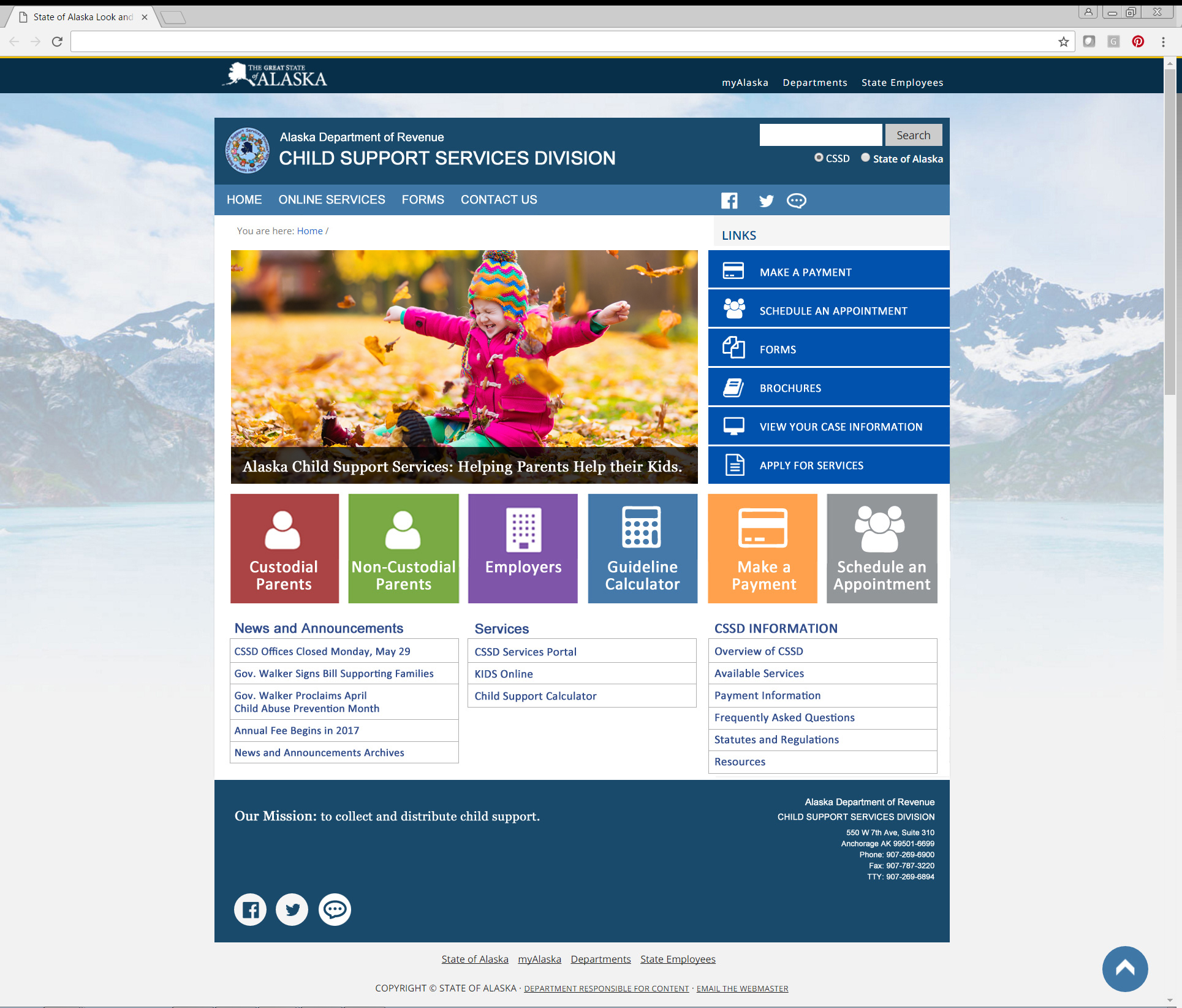
CSSD Home Screen
The redesigned CSSD home screen provides large targets for click or tap access to site resources. Primary click targets are differentiated by color, icon, and text label. Secondary click targets are stacked in right-side column, visually grouped in one color, and differentiated by icon and text label. Main image provides warmth and communicates the purpose of the organization. Home page introduces the underlying modular grid-based structure used throughout the site.

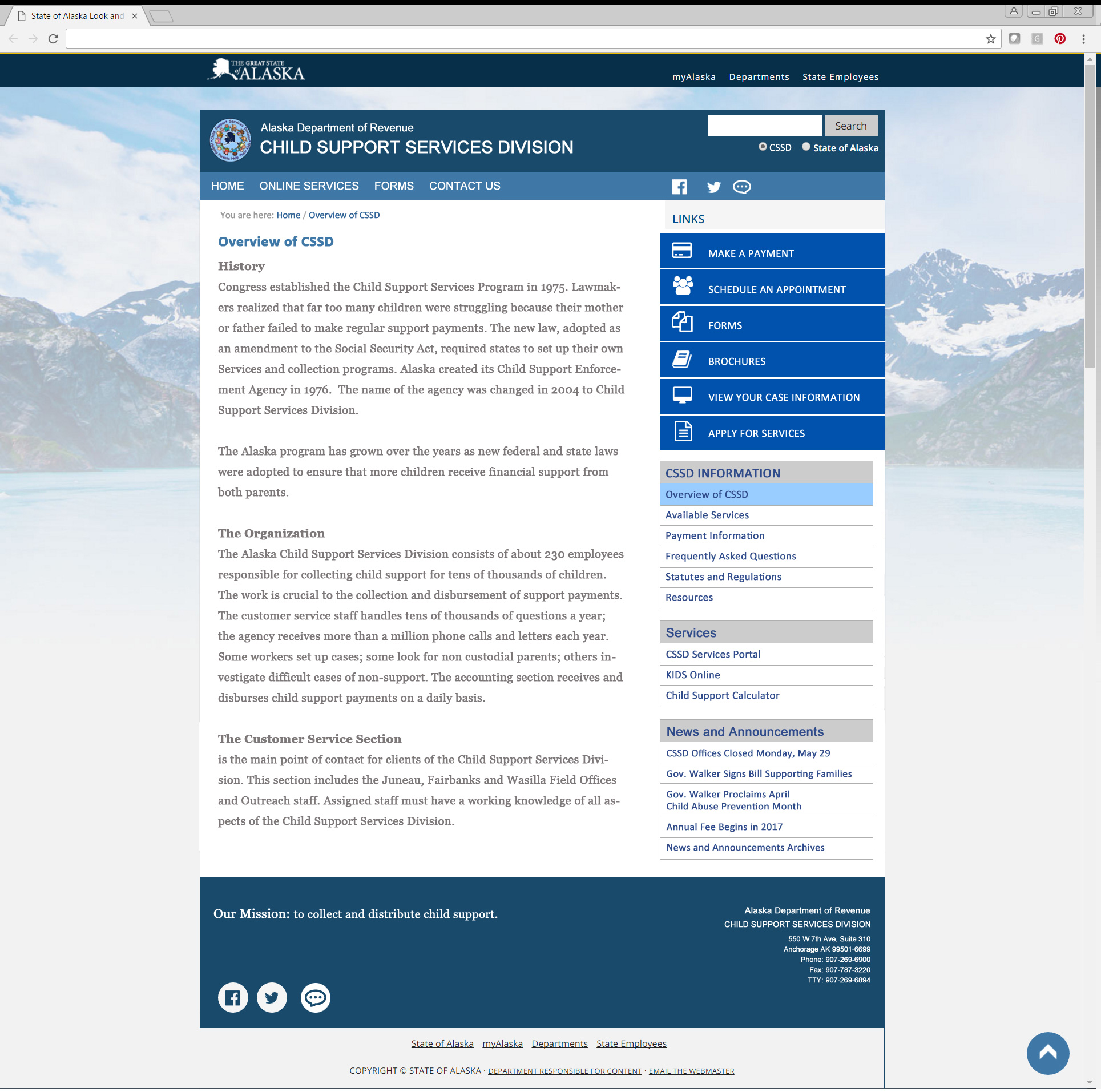
CSSD Secondary Screen
The secondary screen adheres to the underlying modular grid, giving the site a consistent and familiar structure throughout. Main menu items are displayed persistently and consistently in the right quarter of the page, while the text setting in the left three quarters of a page is an optimal width for readability (i.e. 50 to 80 charaters per line).

The modular grid structure is illustrated above. Modules are sized at 180 pixels square with a 14 pixel buffer between modules.

Site managers can use the grid to deploy a variety of content types while maintaining a consistent and familiar layout.

One more example of the many ways content may be consistenly deployed using the modual grid structure.
