Back to Projects
LEO Network
LEO is a network of Local Environmental Observers who share knowledge of unusual weather, wildlife, and environment in their communities. Working with stakeholders from EPA and ANTHC, I developed and deployed our UX and visual branding strategies in parallel.
MY ROLE: lead UX designer, branding lead, and visual designer. Tasks included:
- User research
- Workflow development
- Low-fidelity wireframing
- High-fidelity prototyping
- Typographic design
- Icon system design
- Brand concept and design
- User testing

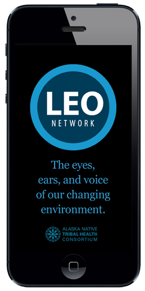
Launch Screen
The launch screen displays for approximately two seconds while the app loads. The screen introduces the mission, vision, and provenance of the LEO Network.

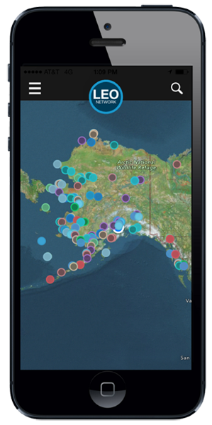
Full Extent
The initial screen displays the full extent of mapped observations. Users navigate using standard gestures, or via search and navigation menus. A separate workflow supports submission of photos, videos, and text for expert vetting of new observations.

Tap for Info
Zooming the map differentiates individual geo-referenced icons. Tapping the icon launches a tool-tip dialog box of observations made by citizen-scientists. Tapping on the dialog launches the Observation Detail screen.

Observation Detail
The Observation Detail screen displays the full text of the vetted and validated citizen-scientist observation. Photo and video content is also supported.
